
Make Better Presentations: How Good Data Visualization Can Advance Your Career
Image via Shutterstock
Guest contributed by Stephanie Evergreen, PhD
Ever been in a meeting where each person’s presentation gets incrementally more boring, even though the data should be intrinsically interesting to everyone in the room. You present to a room where half of the folks around the table are checking email?
Are you capturing your audience’s attention with your presentation and more importantly, can they easily make sense of what you telling them? In fact, research shows that when we present decks with bullets and then proceed to speak to them, we literally interrupt our audience’s ability to make sense of what we are saying. This is because our brains aren’t wired to read and listen to the same content, delivered at two different paces, through two different avenues.
At worst, those around the table are overwhelmed by all of the information being presented and simply check out (or check email). You’ve lost control of your content and the agenda moves forward without your case being made and with decisions still left on the table, leaving you looking less than your totally awesome self.
Instead of the typical way slide decks are delivered, let me give you an effective alternative based on research of how human brains are wired. The brain is wired to first look at the pictures.
Researchers call this the pictorial superiority effect, which means we live in a pictures-first world. So if we focus our slideshow development on having clear, effective visuals, our content will be more readily understood. We will maintain control of the discussion. We will get decisions made. We will stand out.
Turning that slide into effective data visualization is surprisingly easy and can be done entirely within PowerPoint. The trick is to state your bottom line right up front.
I was a guest in an ops review meeting and I listened as the COO of this Fortune 500 company told his team that what he wanted to see on the slide was: (1) your claim, and (2) the visual evidence that supports the claim. What a lovely way of stating it.
In the example above, the bottom line is literally at the bottom of the slide: “Data suggests sales to women are improving.” This is key! It needs to become the title of the slide. We could also re-word it a bit to be more straightforward:
This, alone, will cut down on some meeting noise because people won’t be guessing at what you are trying to say.
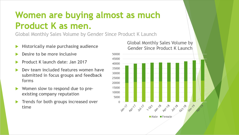
But the visual isn’t really showing the evidence that supports that claim. It isn’t that easy to see the fact that women are buying almost as much as men. A better way to show data stories that have to do with closing the gap is a graph type I call a dumbbell dot plot.
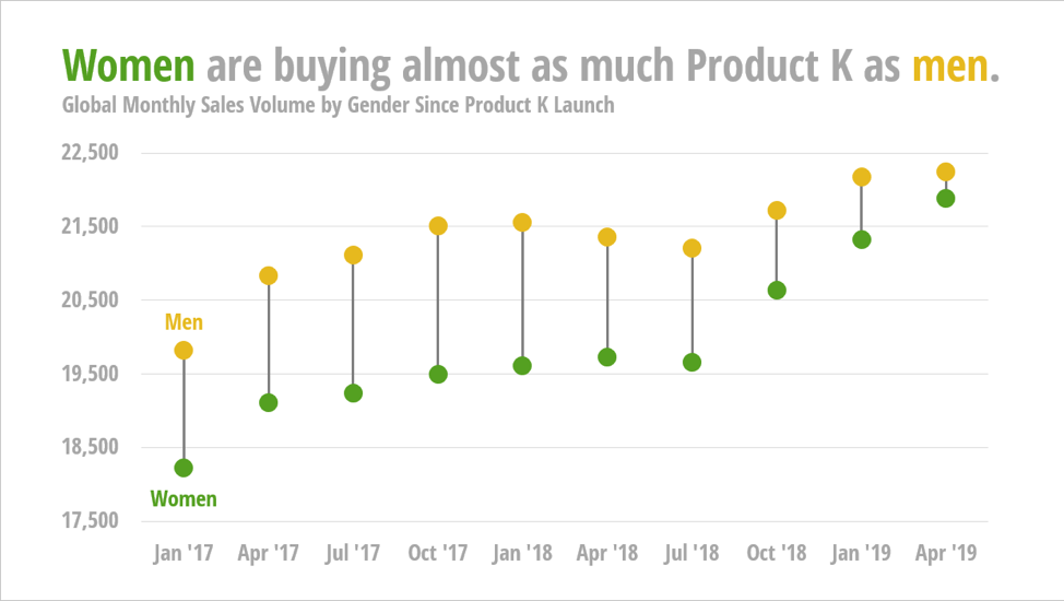
A dumbbell dot plot encodes the data by a dot’s position and research shows that a set of dots, positioned on a scale, is the easiest graph type for our brains to interpret. We then connect two of the dots like a tiny Popeye dumbbell, where the line draws the eye to the space, the distance, the gap between the two dots. This graph type makes it much easier to see that sales are trending up for both groups and that the gap between genders is closing.
Dumbbell dot plots are so easy for people to decode but we don’t see them very often because they aren’t a default graph type in PowerPoint. Want to see how easy it is to make one, though?
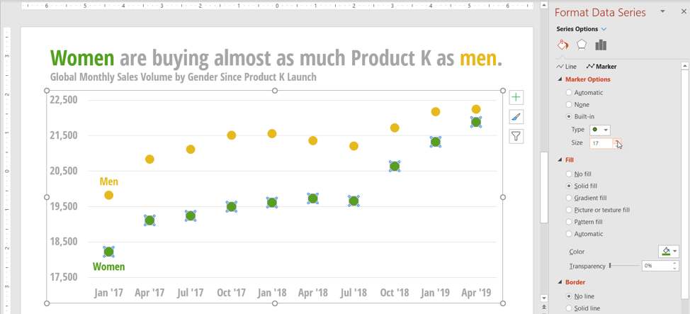
I just started with a line graph with markers. Then right-click on one of the lines and select Format Data Series. Make the line No Fill. Then make the markers large.
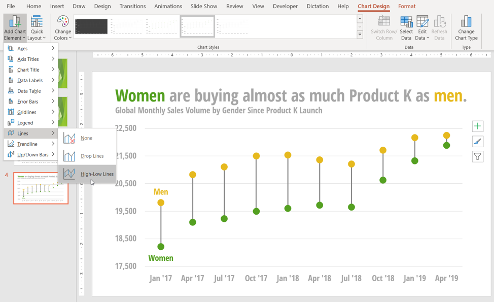
To make the dumbbell stick, look in the menu bar for the Chart Design tab. On the left is a button called Add Chart Element. Open it, navigate to Lines, and select High-Low Lines.
So easy. Such a small change that makes such a huge impact. Of course, I used a better font, ditched the clutter-y slide template, and removed the bullet points and those things will also make it much easier for the audience to see what I came to talk about.
One note, so that you don’t get surprised in a meeting: In some versions of PowerPoint, when you go into full screen mode, the lines appear on top of the dots and it doesn’t look as cool. If that happens to you, copy the graph and paste it as a picture right on top of the graph. Test this out ahead of time.
Knowing which chart type will best showcase your data story is an essential skill that isn’t taught in business school (yet). With million-dollar business decisions and your career on the line, you can come out ahead by adding this skill to your knowledge base and I show you exactly how to choose the right chart type (with the peer-reviewed research that backs up my recommendations) and how make it, step-by-step, right inside Excel and PowerPoint in my latest book, Effective Data Visualization.
A tiny investment into clear, effective slides, where we state our bottom line and then show the evidence that supports it, reaps dividends in meetings. We get our points across without distraction or interruption, we represent ourselves as clear and collected, critical business decisions get made, and we shine. That is how you set yourself up for a promotion.
ABOUT DR. STEPHANIE EVERGREEN
Dr. Stephanie Evergreen is an internationally-recognized speaker, designer, and researcher. She is best known for bringing a research-based approach to helping researchers better communicate their work through more effective graphs, slides, and reports. A Fulbright scholar, she holds a Ph.D. from Western Michigan University in interdisciplinary research.
Dr. Evergreen has trained future data nerds worldwide through keynote presentations and workshops, for clients including Mastercard, Verizon, Chick-Fil-A, Rockefeller Foundation, Brookings Institute, and the United Nations. Dr. Evergreen writes a popular blog on data presentation at StephanieEvergreen.com. Her two books on designing high-impact graphs, slideshows, and reports both hit #1 on Amazon bestseller lists weeks before they were even released. This May Dr. Evergreen has published the second edition of one of those bestsellers – Effective Data Visualization: The Right Chart for the Right Data and the brand new Data Visualization Sketchbook with templates for making infographics and dashboards.
The opinions and views expressed by guest contributors are their own and do not necessarily reflect those of theglasshammer.com